Wednesday, 28 December 2011

Poster anaylsis and research


With this poster/advertisement, the photos differ from the album artwork, although the theme still obviously occurs within the use of colours, text and vibe from the mise-en-scene still runs through consistently, therefore the audience can still notice the similarities and recognize the album when seeing the poster. For example, the red and white colour scheme is very consistent which is mainly used in the artists name and album name. Also, it is obvious that the 50s era has been a huge part in the image and representation in the album and poster, shown through the use of the 1950s microphone and the stage and text which has been put in the lights which were used for the old fashioned cinemas. As this clearly shows the era, this reflects what the sound of the album may consist of and showing the artists inspiration and even personal interests. Furthermore, the faded black and white effect used for the poster reinforces the era as it looks quite old and low key in terms of printing in comparison to most posters, which focus on high quality photography and a good overall quality of the finished product, which in this poster has a more newspaper feel rather than an advert you would see in a magazine like Q, which would have been conventional in the 1950s as technology wasn't as advanced then.


This poster takes a very conventional approach to advertising within a magazine, for example, the artists name is the most important and therefore has the biggest and boldest text on the page and catches the audience attention first. Also as an independent artist, he has used a mid shot of himself to reinforce that importance of him as a solo artist. Furthermore, the albums name is the only text that is predominantly in white and therefore is what the audiences eyes automatically "travel" to next. Conventionally, the poster has added reviews from other magazines/newspapers, which will show the popularity of the artist and the outcome the album has had so far in terms of ratings, which also draws in consumers as through research I have noticed that they don't add those ratings if the album has been judged as average.


I personally think the artists poster and album reflect him as a person and give him the opportunity to create and work on his self image as an artist, as he manages to be a mainstream artist reaching hits with singles such as "She Said", yet through research he manages to be niche at the same time, as he targets mainly male 18-24 year olds and surprisingly a wide variety of different people. He does this through his personal music style which is rap, yet it is not stereo-typically expected for a "rapper" to be into the 50s era and reinforce that factor by dressing how Plan B does. In this case Plan B dresses less grungey and gives himself a more "smart" look. For example, I asked people I knew who listen to specific genres of music and collected the following results:

  • Male listens to bands such as "The Smiths - Kasabian - The Doors - The Beatles" - Liked Plan B
  • Female listens to artists such as "Nicki Minaj - Beyonce - Tinie Tempah - Lady Gaga" - Disliked Plan B
  • Male listens to artists such as "Eminem - 50 Cent - Tinie Tempah - Lil Wayne" - Like Plan B
  • Female listens to artists such as "You Me At Six - Paramore" Disliked Plan B

Therefore, although I only took a small sample of people, just from those results I can gather that Plan B definitely targets a male audience instead of female. Also, it is interesting how someone who listens to The Beatles who originate from the late 50s/60s listens to Plan B as well as another person who listens to rap artists, showing Plan B's unique style within the music industry, which is demonstrated through the poster alone. Furthermore, as many people would assume Plan B as a maintream artist, I also find it interesting how a girl who listens to very mainstream artists didn't like Plan B. To conclude, I think as Plan B gains individuality within his sound and appearence, he starts to target a different audience of people.
Monday, 12 December 2011

Advertisement in poster (conventions)

Placing advertisments for albums by using posters is a very old fashioned way of advertising and has been done for years, through placing these posters in magazines mainly. Although, this way of advertising is still a popular choice and has extended to advertising these posters in larger areas where they can be seen and target their audience more easily, such as being printed on buses, bus stops, TV (music channels, E4) and artists official websites, where it will be seen all the time by their target audience. Although, it depends on the genre whether the album would be advertised in magazines or not. For example, the examples used below share a similar alternative/rock genre and therefore I have found that they have been advertised in magazines such as NME and Kerrang. Whereas, through research it is slightly more rare for mainstream artists to advertise through this way and instead have other ways to advertise, such as short album clips on VEVO known as "teaser trailers" as well as being able to tell their fans about new albums and singles on social networking sites such as facebook and twitter which are extremely popular in terms of advertisement. 

On the other hand, the biggest mainstream artists such as Lady Gaga have the advantage of being to advertise through ways which will be seen a lot more by everyone, for example they will be paid to be featured on front of popular magazines such as Q or even in interviews in fashion magazines such as BAZAAR where they will still be able to promote their new album. 

Through researching in magazines and the internet, I have noticed myself that the conventions of a advertisement poster to promote an album include:
  •  Album name
  • Artist name
  • Date released
  • Where it can be bought
  • Price (sometimes)
  • Website
  • Reviews
  • Photography that matches the album artwork (or similar)


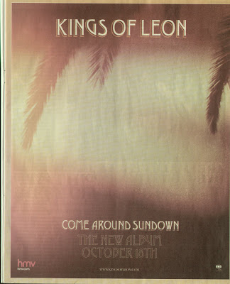
As shown in the two pictures above, this album (Kings Of Leon - Come Around Sundown) shows the typical conventions of how the poster that promotes the album link together. For example, the same scenery, text font and colour scheme has been used so that consumers will be able to recognise the album when it does come out, due to the album art. With this album art work in perticular, the use of bright oranges reflects the summer feeling, linking in with the album name. Also, by using photography like this which is simple photography, it shows that the band are alternative and not promoted in a way that focuses on their identity, and more that they are recognisable enough to focus and to be known for the sound of their music. This poster advert was displayed in a HMV store, where music lovers and their target audience would go to be able to see the poster straight away as the size would be very big considering it was the next biggest album for Kings Of Leon to release in quite a long time.
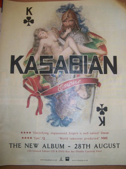
The Kasabian, Empire album also does the same through the use of pictures and fonts being identical for the same reasons, being that the album will be recognisable to the audience when it has been released. Although the poster has a little more detail as this it been taken from a magazine and therefore needs to add extra information about when the album is being released as well as reviews, which is very conventional. In the poster, the date the album comes out has been intentionally done in large print so the audience can notice it clearly, making it seem like one of the main important aspects on the poster. The album cover is also very abstract whilst also being influenced by the romanticism era through the use of old fashioned art, which insinuates that the band are quite alternative, cultured and are not mainstream pop/rnb.

Thursday, 8 December 2011

Poster anaylsis and research

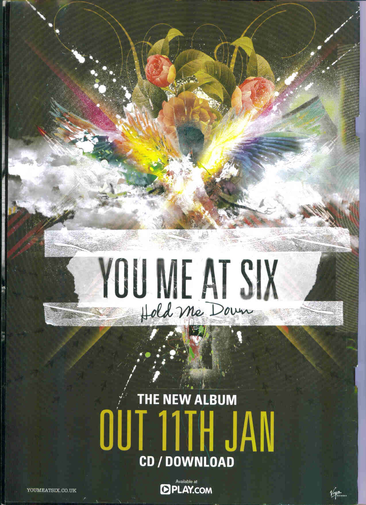
You Me At Six are a british rock band who have steadily made success in both the UK and America. Considering the genre is rock with a slight pop edge, the band target quite a niche audience but have an equal amount of female and male fans, therefore by choosing this complex and colourful design for their poster and album shows that they do target a unisex audience, in comparison to maybe using certain colours which fit the stereotype of a girl, conventionally being the colour pink.  Furthermore, they target a quite large age group according to Youtube statistics, differing from 13-24 years of age, therefore again by using a design like this it represents a mature yet "young" edgy style within the band, which shows what they represent as a band as they are still quite youthful.

The album artwork has been used on the background of the poster, so that the audience can recognise the album when it has been released. Therefore, the same fonts have been used too for that purpose. Although, the poster has added more information onto it so that the consumers know when it will be released and where. The release date has purposely been printed on the poster in extremely large font that fits in with the theme of the album cover (by using similar colours and fonts), which focuses on catching audiences attention. As the aim of the poster is to draw fans and other consumers in to buy the album, they have decided to make certain text more dominant on the page. For example, the text which says the release date is the main focus of the page (apart from the band name) and catches the audiences attention first as the size of the text is the same as size of the bands name and is the same font style, showing that they are both the most important aspects on the page.

Although, considering the band has a rock genre and targets quite a niche audience, a more popular way to advertise unreleased albums is to advertise through Youtube, which through my current statistics taken from my poll, is a very popular way to access music as thousands of videos are uploaded each day. Also, another reason why YouTube is good for advertising on is because it can easily introduce people to new music as it automatically suggests recommendations for the viewer judged on what they have viewed in the past.


This is an advert taken from a magazine advertising the newest album that You Me At Six have released, Sinners Never Sleep. I couldn't find a singular A4 side poster of advertising this perticular album, which could be due to it being released in quite a small space of time to the album before it, therefore the build up for the album not being as "big" or anticipated for. Although, through research, this album was advertised through the release of a single that they put out on YouTube, which was called "Bite my Tongue" which became very popular before the actual video was released, as the videos release date was anticipated by releasing trailer videos and an official lyric video, which is a very new way to catch the audiences attention as Youtube is extremely popular with all ages and generations. For example, 3 seperate "trailer" videos would countdown the date that the actual video would be released and give away sneak peaks at the video, to attract their audience and fans. 

This advertisement in perticular is very small and takes up a very small space in a magazine, which I personally think is due to hard copys of CD's/albums not being very popular anymore and therefore are mostly only hardcore fans or collectors items, as the majority of people now download their music from the internet via itunes. I don't know what magazine it was taken from, therefore I'm taking a guess that it was taken from Kerrang or NME as they are the types of magazines that are associated with this genre of music and I have seen them being featured in them in the past.

The price has been made the most bold and eye-catching text on the page meaning it has an importance in terms of trying to sell as many as possible. Conventionally, they have also made the price this bold as it is quite a low price and therefore will interest the minority that do still buy albums. Conventionally, band pictures have been placed on the advertisement, which is a typical mid shot which is very stereotypical for an alternative rock band like You Me At Six to do. Also featured on the advertisement is the album cover, which is again quite a conventional aspect for small adverts like this to do. Although it's not extremely obvious, this small advert has still kept within the theme of the album cover by dark contrasting colours, black and white, which is reflected on the album cover too.

Monday, 5 December 2011

Digipak analysis

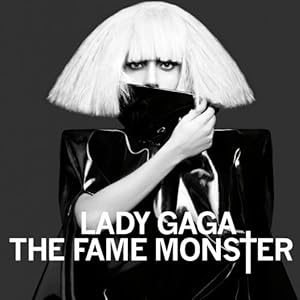
As Lady Gaga is one of the most talked about mainstream artists today, this album represents clearly how she has gained the flexibility to be as creative and push the boundaries as much as she can and wants. Although, she still sticks with the conventional patterns within digipaks and albums for mainstream artists. For example, in terms of the mid shot used for the photograph of Lady Gaga that has been chosen, it reflects her importance as an artist, which is shown by using the center positioning of Gaga and the use of a completely blank background, meaning there are no distractions therefore the audience can only focus on her, also people will be able to recognise her very easily as she is a very well known artist around the world. Also, through the use of contrasted black and white which is consistent throughout the whole digipak, it highlights the clothing, make-up and hairstyle, which has been used for Lady Gagas image to exagerate her extreme look which could be seen as quite dark and in a sense "rocky", as she is very well known for being culturally knowledgeable when it comes to different styles around the world, demonstrated in other outfits she has worn, and therefore represents her individuality.

Also, as the album is called "the fame monster" it uses the black and white contrast as they signify the horror/scary connotations, espiecially through the reinforcement of the expressionless face that Gaga has on this photograph which only her eyes and nose are revealed. This photo also shows that the mise-en-scene such as clothing and make-up is very important on the front cover for artists, espiesially for big artists which through research it is very common for the photography to be kept very simple and the setting to be kept to a bare minimum which makes a bigger statement and catches the audiences eye a lot quicker.

Although, the front photograph differs from the rest of the photographs used for the rest of the digipak, which isn't necceserily a conventional approach to the photography for a digipak, but it's the most important photograph on the album as it is displayed on the front cover and therefore will attract the target audience as it will be the first thing they see when it's stacked on shelves or even when buying online. Also, the black and white contrasting effect has been kept to keep with the house style theme.
The font used for the opening compartment, which is where the discs are located is the same font used throughout the entire digipak, and is very bold to catch attention and uses the the cross which replaces the "t" again, like the front cover, which maybe represents personal beliefs for her or has a hidden meaning. As the digipak opens, the black and white contrasting look is kept very consistent and keeps to the whole theme of the digipak. The two disks are conventionally identical in terms of what is included on them which is the album name as well as the artists name and either "disk 1" or "disk 2".

                                                                                          
 Before you open the digipak to reveal the two disks, the other two panels consist of photography which seems to be very important in terms of mise-en-scene and what they represent. For example, Lady Gaga has decided to focus her images on a very emotional look, which is very different to the front cover in terms of mise-en-scene as the make-up and hair colour/length changes, but again uses mid shots for both sides. I personally think Gaga has decided to use a different look on her cover which is slightly less "scary", so when buyers open the digipak you can reveal the "monster" and dark side, which could reflect Gaga as an artist or even as a person. This is done by the look which she has on her face, which is quite expressionless in the sense of being the opposite to happy, which could relate to personal feelings or past experiences. Also, she is naked in these shots and uses a dark wig which on the left photograph covers her face, which personally to me looks like it has connotations of insecureness/shyness/scared/lonliness.


The back cover focuses on a mid shot with a black/grey background which is another factor which has been consistent, keeping the theme running throughout. Also, the photograph matches the ones in the opening compartments inside, but differs in terms of where Gaga is looking and therefore has a different effect. For example, she has decided to look into the camera and make this photograph more of a statement such as the photograph on the front and therefore connects more with her audience. This has been done because the front and back covers are the most important and again, is what the consumers will see first, not the inside. Also, the conventions consist of the usual tracks listed, which through my research depends on the artist and layout where they have decided to locate the list, alongside the barcode, the record label and sometimes the price and website, which have all been kept within the black and white colour theme.

Sunday, 4 December 2011

Digipak conventions

Conventions of a digipak are include:
  • Price
  • Album name
  • Artist name
  • Website
  • Logo
  • Record Label
  • Barcode
  • Who wrote the songs
  • Lyric booklet (sometimes)
  • Recording information, producer, where it was recorded and when
  • Track listing
  • Album artwork
Although, aspects of these conventions and the style of the digipak use to differ depdending on the audience and genre, although through research, I have noticed that the mainstream audience have effected the way in which artists sell themeselves through their albums.
Through research of statistics taken from Youtube, Katy Perry targets over 60% of her listeners being teenage girls and the rest of the percentage being males. Whilst Perry represents a bubbly fun artist with an individual style, she is also known for her attractiveness which targets her male audience more. This is reflected in her album artwork through the use of the clothing and make-up, for example the red lipstick she is wearing which has connotations of passion and love. Although she still manages to keep the quirky innocence and unique image within her style. One example of this would be the choice of theme for her digipak, which is candy, which by using this shows the young side as candy is more connected with children.  As she is very mainstream and her sense of unique fashion is quite important to her as an artist, they have decided to use the black background and simple mid/long shots for the photography, which is a very modern way to approach a digipak for the bigger artists, especially for artists who want to make a statement and impact on the music industry.

On the other hand, Rihanna who has changed quite a lot in terms of genre and mixes between RnB, Pop and Club/Electro in some of her songs. Therefore, in terms of her digipak, this one has stepped in a completely different direction to her last digipak which was very RnB (second picture) as it used conventions expected of that genre, such as the browns and golds and the way Rihanna is posed in this album is a lot more suggestive than the newest album she has brought out. In the top digipak it is clear that Rihanna has taken a more modern approach to the theme and it looks a lot more "feminine" and clean cut through the use of light colours which has been softened using effects and could reflect innocence and reinforce her femininity, therefore definitely targets her female audience through this look, also using the floral background reinforces that point as stereotypically girls are more associated to floral patterns than boys. Personally, I think as it has become more mainstream to be a lot more unique and quirky with style, this album defines Rihanna as her own artist a lot more than her previous digipak which was very conventional to what her music consisted of at the time which was very RnB. For example, judging from cover you wouldn't expect the album to consist of the music that it does.
More Research
(ordered when they were released starting from an earlier date - today)
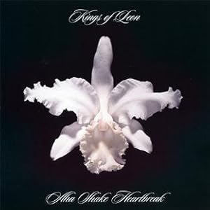
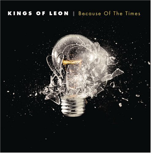
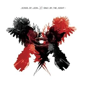
Kings of Leon are an american rock band which started off targetting a niche audience as they had a unique sound which wasn't very popular at the time they released their first album, which is quite clear when you look at the album cover "Youth & Young Manhood" as the simple use of black and white contrast in the first album artwork is very 60's and gives off a "retro" image, reflecting that there music is inspired by work such as The Beatles, showing straight away to audiences who don't know them as a band that they have a rock/alternative genre. Although, over the years this is a sound that has become very popular and now Kings of Leon have become more mainstream as a rock band. Through research it is very conventional for mainstream alternative/rock bands to use effects such as art and scenery more than the actual photography of the band members, being the most modern approach to album covers and digipaks. This is reflected in the last two albums in perticular which use exactly these effects for their albums. More examples of bands who use to be mainstream and share the rock/indie genre, in which their album covers use the conventional designs I spoke about:
History and changes in terms of digipaks

Christina Aguilera and her two albums above are a perfect example of how society has changed in terms of how important the music has become in comparison to the artist and how much the imagery has changed which has been used on the front of albums. The two albums have eight years between them and although fashion has come a long way in that amount of time, it still shows a huge sense of how "the more unique, the better" has developed alongside developing a better sense of the artists individuality to get noticed. Which eight years ago wasn't the case (or not as drastically as today). For example, in 2002 when Christina Aguilera's album Beautiful was released she was mainly a Pop/RnB artist, which at the time was conventional for the look she has used, to be used on album covers which is the close-up of Christina's face in a dull black and white effect, which flatters her appearence but isn't exactly recognisable in terms of who the artist actually is, and doesn't show a sense of individuality, which today is a huge importance in terms of selling. Whereas, an RnB artist today would still choose quite a statement piece of photography of themeselves for the front.. for example :

Mary J Blige has been a consistent RnB artist throughout time and therefore has noticed the changes within the music industry, which is reflected in her newest album cover. The difference between this RnB album cover in comparison to Christinas "Beautiful" differs in terms of the statement being made with the posture Blige holds, showing a mid/long shot which looks as if it could symbolize, female dominance, whereas Christinas old album doesn't represent a positive image due to her pose which is quite dull and possibly sad looking.

The reasoning behind the drastic style changes could be because of the amount of artists that have made it in the music industry increasing, therefore increasing the competition as well. In comparison to Christinas earlier album, her newest one "Bionic" is very bold in terms of mise-en-scene and reinforces the fact that there is competition in the music industry, through the use of bold colours which are very eye catching. It is also very clear who the artist is, and she has tried to overcome her "normality" as the artist she was before and decided to take a more interesting approach to her style and image through use of hair and make-up. The artwork on the cover shows half of her face covered with a robotic design to try and target the mainstream audience as artists such as Katy Perry, Lady Gaga and Nicki Minaj demonstrate how the unique look is very popular and catches the most attention and are huge competition in the music industry right now. Also, a close-up has been used which is very popular for mainstream artists to do, with the use of a plain white background, which makes the bold colours stand out a lot more, therefore catching a lot more attention.  

Health and safety

Step 1 - Look for hazards
Don't get bogged down with trivial hazards; concentrate on those posing a significant risk or harm

Step 2 - Who will be harmed and how?
Think about who may be affected and those who are particularly at risk.

Step 3 - Evaluate the risk
Consider the chance and severity of harm that each hazard may cause, taking existing control measures into account.

Judge whether an actual risk (high, medium or low) is likely from the identified hazard. Determine the necessary control measures using the following hierachy of approach.

  • Avoid the risk completely; bit if this is not possible
  • Reduce the risk to acceptable levels;
  • Provide training and instruction, and personal protective equipment if the risks cannot be controlled in any other way;
  • Reduce the risk at source by developing safe systems of working, giving collective measures priority.
Step 4 - Record the significant findings
The significant findings of the risk assessment should be recorded and communicated to those people who may be affected. In practise, this means ensuring that the production team and any contractors are informed of the significant hazards, the likely risks and the required control measures. Keep a record for future reference, it will help to demonstrate compliance with legal duties. The legal requirement to record findings applies if five or more people are employed but smaller companies are recommended to record details in order to show that they carried out risk assessment.

Step 5 - Review and revise your risk assessment
New hazards can be introduced if there is any significant change in the activity, equipment, substances or procedures. Risk assessments should be revised following any significant change or when they become out of date. If there have been no changes, the assessment should be reviewed at least once every three years to ensure that the precautions are still working effectively.


I struggled to find any more risks that could have been involved as my settings were quite safe places. For example, for my chair scene, there was a very small amount of objects in the room apart from the lighting and the chair my performer was sat on, as she didn't have to do anything I couldn't find an issue with this. Furthermore, the tracking shots down the alleyway were clear and empty as I chose a place where I knew not many people used, as well as not being near any main roads (which would have been a risk). The rest of my shots were taken in small empty music rooms that only consisted of my artist having to stand and act/perform, therefore I couldn't find a risk in with that either. Although, I always filmed with at least another person in the room, to ensure that nothing would be at risk and go wrong.


Saturday, 3 December 2011

Results from poll

3 Females and 4 Males took my survey in which they all were between the age of 17-20. I gathered the following results:


5/7 people watched their videos on YouTube
6/7 people watched performance based videos
5/7 listened to the Rock/Alternative genre


Due to the large number of people watching their videos on Youtube, it reflects the popularity of that website and the access it has to millions of videos, due to VEVO which has their own successful channel on featuring the newest videos as well as their own music website. This shows that the easy access to the music/music videos is a popular and preferred way for the  young population. 


Furthermore, as a huge 6/7 people asked said they prefer performance based videos, this may be due to the 60% of people asked preferring the Rock/Alternative genre which conventionally are based around a performance based video, including mainly the band being the main focus.


On the other hand, 1 person said they prefer abstract videos which I found may be due to personal taste and may be more stereotyped to the 1 person who said they preferred Mainstream/Pop genre music, as conventionally today artists have taken an abstract approach to their videos as it enables them to reflect creativity and a unique identity. 


Overall, I have concluded from this data that young adults of both sexes use YouTube as a source as music, as well as enjoying performance based videos. Although, I didn't find that this way of finding out more information from the general public seemed to be very helpful due to not being able to know the divide between what the males voted for and what the females voted for, as if that was the case I would be able to make more conclusions and see if there was a certain pattern.

Filming/Editing times and updates

I did do some filming on the 26/11/11, which included my tracking shot which takes up around 50% of my song at the most. Although, I found trouble with being able to cut the scenes in the right places and get my shots how I wanted, therefore I had to adjust part of it, although watching it back I know I am not happy with it.

Also I found that the timing in which my actress and me were walking were out of sync and therefore looks messy as we my actress doesn't stay at the same pace I want which would be a mid shot throughout the tracking shot. Although, after that practise I know what I need to change and hope to be able to film that shot in perticular the best I can and to do so on these times:

09/12/11 - 1:40-2:50 - chair scenes which include mid-shots and close-ups in which will be filmed in the drama studio as well as the chorus which is the microphone scene, which I will hopefully be able to do aswell.
10/12/11 - Mid-day - tracking shot of artist walking which is the majority of my song and main focus and hopefully any parts that I may have missed out the day before
11/12/11 - Mid day - mirror scene and extra scenes I may have missed out or not been able to do
15/11/12 - 10:20-11:30 - extra scenes that fit in between my main ones filmed in the above dates

Update
Due to complications with the camera and my saved work which was on a memory card, I will have to redo what I did before over the short period I have. Although I have arranged a date in which my performer will be able to film and I will be able to get at least half of my filming done within a day and therefore still giving me time to edit it and giving me time to re-film parts I may like to change.

28/02/12 - I have been able to film my tracking shot which is a very important part of my video as well as the mirror scene, therefore this week I intend to film the shots which I will need for my chorus in college, due to being able to use equipment such as a microphone and the green room. Also, this week I hope to be able to finish the difficult part of my filming which is the fast drumbeats in the song, which involves using the greenroom and controlling the lights in there. I will then start to edit put my video together whilst filming the extra parts on the weekend.
09/03/12 - First edit
12/03/12 - Edited again for an hour and got as much as I could done until the next time I film which will be tomorrow and friday for definite as I have already booked out my camera.
14/03/12 - Filmed at 1:40-2:20 and did my third edit for an hour.
19/03/12 - I have edited the most I can for now and have booked out the camera for tuesday and wednesday to finish the last of my filming. Furthermore, I will be taking photos for my digipak and poster tomorrow and putting my ideas together for those too.
21/03/12 - Filmed the chair scene and took various photos for experimenting. Booked the camera over the weekend, to finish the rest of my video and photoshoot for my digipak and poster.
22/03/12 - Edited the parts of the filming that I was done yesterday.
2/04/12 - 6/04/12 - Throughout this entire week I spent all of my free hours (total of 10 a week), an hour after college 3/5 days this week and time at home to finish my products.

Saturday, 5 November 2011

Costume change/looks

Through research mise en scene within music videos is obviously a very important aspect and does not only set up the genre, but enables the audience to gather the "vibe" from the artist and what they're style and individuality. Therefore, I have gathered a few images that I think would fit in with the rock genre that I would like to maybe reflect/take ideas from for my music video.
(images taken from LookBook.nu)

I acknolwedge that fur coats were a very big image back in the 1950s which indicated wealth, but through the years the fashion trend came back which provided a more alternative image. Therefore, as I believe costume change is important in a music video I would like my artist to have a fur coat on in part of the video as I think it would set up my characters image to be rock and roll (due to attitude and make-up) yet sophisticated and cultured.  


Another costume change idea would be to put together an outfit like this for my artist. I think the "grunge" look could work well with my video as it is a style that originates from the 90s (mainly) and came from stars such as Cobain, from the band Nivana which is one of The Pretty Reckless's influences. Also, it would represent my artist in the way I want, which is not the typical mainstream style, instead, these two looks combined shows that my artist is cultured and unique in terms of the eras she takes her fashion from. 


80s Purple Bold Wayfarer, Diesel Leather Jacket
I would maybe like to fit this look into my video somehow as I think it shows a rock style in a sophisticated way through the use of the Ray-Ban glasses, the style of the hat and leather jacket, which are probably the aspects I think I would like to take from this look.


Friday, 4 November 2011

List of shots, props, settings.

Shots I plan to use
  • Close-ups
  • Extreme close-ups
  • Long shots
  • Tracking shot
  • Over the shoulder
  • Medium close up  (most common in my video with the tracking shot which is continuous throughout the majority of the song)

Props/Costume and other things I need
As my song choice has the genre rock/post-grunge, it's important that the genre comes across in the video with not only the sound but my artist with the clothes worn as well as the props used. 
  • Leather jacket
  • Heavy black make-up
  • Red lipstick
  • Pale complexion
  • Either DrMartens (preferabley) or heavy black heels.
  • Microphone
  • Mirror/Dressing table
  • Single chair
  • Rope
  • Black tape
  • Fur coat
  • Cigerette
  • Access to the green room
Settings
Throughout filming I may have to change the settings due to being unable to access them but hopefully I will able to access the following places:
  • Stage (although therecording studio would be the second option)
  • Street or alleyway. Although, a forest would be an option which will create the dark and "mysterious" look that I want and also reflects connotations of "fearless" which could link into the lyrics and her feelings. Although, again, I would have to take into account that I would need to set up good lighting to pull this kind scene off.
  • Dark empty room which I will able to light up without other objects unintentionally in the way (possibly the college green room).

This picture is idealy the kind of street/alleyway where I would want my tracking shot to be filmed, as I think it's dingy, dark and narrow, slightly worn out and would fit within my genre perfectly due to the repetitive shot of only being houses and nothing else that would distract the audience. For example, if I shot in a field or forest, I would have to be aware of the surroundings and make sure there would be no cars, people, animals or  any other objects that may not be relevent for this scene.

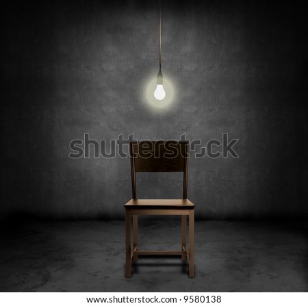
This photo reflects near enough exactly how I want one of my settings to look like, which will include the bare minimum of objects possible to create this effect, which is dark and contrasting. I also think it has certain connotations of emptiness and "trapped emotions" due to the lack of objects in the shot, although this depends on how you interepret the song and it's lyrics. Although, I would like to experiment with the mise-en-scene in this shot by maybe adding props in the background which could link to certain lyrics and hold a certain message, for example, ripped wallpaper, smashed photoframes, empty boxes, which from the audiences point of view, could be either irrelevant to the song or be associated with the meaning of it.


Thursday, 20 October 2011

Photos (Influence for music video)

I decided to research Blondie knowing that they were big during the 70's and 80's. Furthermore, because they share the same genre of music that I have chosen and had a girl a the lead singer, which is a similarity that I think is very important. Also, judging from a few pictures, it is quite obvious that Taylor Momsen has taken some inspiration from the look and attitude that Deborah Harry sometimes did on stage.

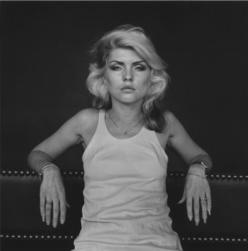
This photograph of Deborah Harry in contrasting black and white has also given me inspiration for my video. The mise-en scene in this photograph is very simple but as it's very bold in terms of make-up and clothing it catches the audiences eye a lot more than a shot that is too busy and over-the-top. This gives me ideas for scenes that would include my "artist" sat on a chair lip singing into the camera, although a lot more bent over with her wrists leant against her legs,which again shows a certain rebellious attitude.


The idea that I described above would also work with this angle and posture too. Apart from I personally think this mid-shot and position shows a lot more dominance within the artist as she is the main focus and placed directly in the middle of the shot. Also, her arms are placed on the back of the chair showing a careless and slightly "bossy" attitude again. These are all characteristics that hopefully the audience will see in my artist.
This photograph influenced me with the idea of smashing a guitar in one of my shots as it is quite a "rock and roll" thing to do, which a lot of big stars do/have done on stage as it creates an element of shock and excitement for their audience. Therefore my idea would be for my artist to take the guitar off the guitarist, and smash it against the floor or the edge of the stage, in slow motion preferabley. This would show her bad attitude and even pain or annoyance from her past relationship which she talks about it in the song. Although, the problem would be getting this set up to look realistic, which hopefully I would be able to do, but getting a real guitar to do this to could be a problem, therefore it may be replaced with another object. Also, I have seen Miley Cyrus use a similar idea in one of her videos.
Artist Norman Rockwell inspired me with this picture and mostly the angle it's shot from for my idea with my musician singing into the mirror dramatically. Although, the main ideas I would want to take from this painting is the objects around it, which I would want to do (but objects that signify something) and the dark grungey colour scheme. Although, certain aspects would be changed as I'm not sure if I want my artist to be sat down.This picture found on Tumblr gave me the idea about mise-en-scene and positioning, I think maybe as a back-up idea I would like to include something associated to this photograph as I think it's very bold in terms of the messages you can get from it.