Conventions of a digipak are include:
- Price
- Album name
- Artist name
- Website
- Logo
- Record Label
- Barcode
- Who wrote the songs
- Lyric booklet (sometimes)
- Recording information, producer, where it was recorded and when
- Track listing
- Album artwork
Although, aspects of these conventions and the style of the digipak use to differ depdending on the audience and genre, although through research, I have noticed that the mainstream audience have effected the way in which artists sell themeselves through their albums.

Through research of statistics taken from Youtube, Katy Perry targets over 60% of her listeners being teenage girls and the rest of the percentage being males. Whilst Perry represents a bubbly fun artist with an individual style, she is also known for her attractiveness which targets her male audience more. This is reflected in her album artwork through the use of the clothing and make-up, for example the red lipstick she is wearing which has connotations of passion and love. Although she still manages to keep the quirky innocence and unique image within her style. One example of this would be the choice of theme for her digipak, which is candy, which by using this shows the young side as candy is more connected with children. As she is very mainstream and her sense of unique fashion is quite important to her as an artist, they have decided to use the black background and simple mid/long shots for the photography, which is a very modern way to approach a digipak for the bigger artists, especially for artists who want to make a statement and impact on the music industry.

On the other hand, Rihanna who has changed quite a lot in terms of genre and mixes between RnB, Pop and Club/Electro in some of her songs. Therefore, in terms of her digipak, this one has stepped in a completely different direction to her last digipak which was very RnB (second picture) as it used conventions expected of that genre, such as the browns and golds and the way Rihanna is posed in this album is a lot more suggestive than the newest album she has brought out. In the top digipak it is clear that Rihanna has taken a more modern approach to the theme and it looks a lot more "feminine" and clean cut through the use of light colours which has been softened using effects and could reflect innocence and reinforce her femininity, therefore definitely targets her female audience through this look, also using the floral background reinforces that point as stereotypically girls are more associated to floral patterns than boys. Personally, I think as it has become more mainstream to be a lot more unique and quirky with style, this album defines Rihanna as her own artist a lot more than her previous digipak which was very conventional to what her music consisted of at the time which was very RnB. For example, judging from cover you wouldn't expect the album to consist of the music that it does.
More Research
(ordered when they were released starting from an earlier date - today)
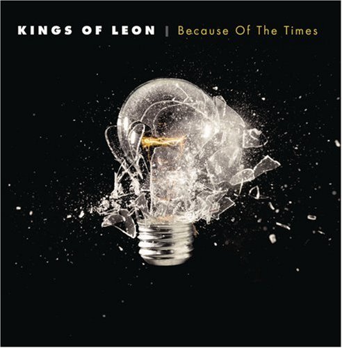
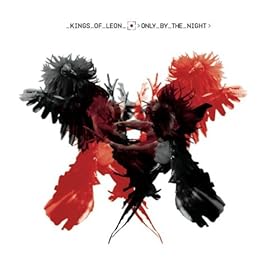
Kings of Leon are an american rock band which started off targetting a niche audience as they had a unique sound which wasn't very popular at the time they released their first album, which is quite clear when you look at the album cover "Youth & Young Manhood" as the simple use of black and white contrast in the first album artwork is very 60's and gives off a "retro" image, reflecting that there music is inspired by work such as The Beatles, showing straight away to audiences who don't know them as a band that they have a rock/alternative genre. Although, over the years this is a sound that has become very popular and now Kings of Leon have become more mainstream as a rock band. Through research it is very conventional for mainstream alternative/rock bands to use effects such as art and scenery more than the actual photography of the band members, being the most modern approach to album covers and digipaks. This is reflected in the last two albums in perticular which use exactly these effects for their albums. More examples of bands who use to be mainstream and share the rock/indie genre, in which their album covers use the conventional designs I spoke about:
History and changes in terms of digipaks
Christina Aguilera and her two albums above are a perfect example of how society has changed in terms of how important the music has become in comparison to the artist and how much the imagery has changed which has been used on the front of albums. The two albums have eight years between them and although fashion has come a long way in that amount of time, it still shows a huge sense of how "the more unique, the better" has developed alongside developing a better sense of the artists individuality to get noticed. Which eight years ago wasn't the case (or not as drastically as today). For example, in 2002 when Christina Aguilera's album Beautiful was released she was mainly a Pop/RnB artist, which at the time was conventional for the look she has used, to be used on album covers which is the close-up of Christina's face in a dull black and white effect, which flatters her appearence but isn't exactly recognisable in terms of who the artist actually is, and doesn't show a sense of individuality, which today is a huge importance in terms of selling. Whereas, an RnB artist today would still choose quite a statement piece of photography of themeselves for the front.. for example :
Mary J Blige has been a consistent RnB artist throughout time and therefore has noticed the changes within the music industry, which is reflected in her newest album cover. The difference between this RnB album cover in comparison to Christinas "Beautiful" differs in terms of the statement being made with the posture Blige holds, showing a mid/long shot which looks as if it could symbolize, female dominance, whereas Christinas old album doesn't represent a positive image due to her pose which is quite dull and possibly sad looking.
The reasoning behind the drastic style changes could be because of the amount of artists that have made it in the music industry increasing, therefore increasing the competition as well. In comparison to Christinas earlier album, her newest one "Bionic" is very bold in terms of mise-en-scene and reinforces the fact that there is competition in the music industry, through the use of bold colours which are very eye catching. It is also very clear who the artist is, and she has tried to overcome her "normality" as the artist she was before and decided to take a more interesting approach to her style and image through use of hair and make-up. The artwork on the cover shows half of her face covered with a robotic design to try and target the mainstream audience as artists such as Katy Perry, Lady Gaga and Nicki Minaj demonstrate how the unique look is very popular and catches the most attention and are huge competition in the music industry right now. Also, a close-up has been used which is very popular for mainstream artists to do, with the use of a plain white background, which makes the bold colours stand out a lot more, therefore catching a lot more attention.


No comments:
Post a Comment