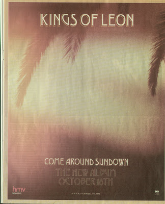
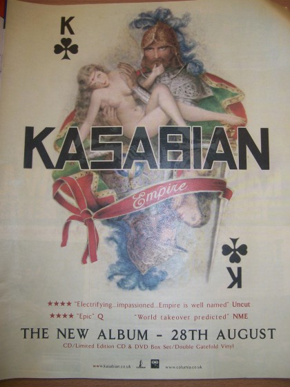
Placing advertisments for albums by using posters is a very old fashioned way of advertising and has been done for years, through placing these posters in magazines mainly. Although, this way of advertising is still a popular choice and has extended to advertising these posters in larger areas where they can be seen and target their audience more easily, such as being printed on buses, bus stops, TV (music channels, E4) and artists official websites, where it will be seen all the time by their target audience. Although, it depends on the genre whether the album would be advertised in magazines or not. For example, the examples used below share a similar alternative/rock genre and therefore I have found that they have been advertised in magazines such as NME and Kerrang. Whereas, through research it is slightly more rare for mainstream artists to advertise through this way and instead have other ways to advertise, such as short album clips on VEVO known as "teaser trailers" as well as being able to tell their fans about new albums and singles on social networking sites such as facebook and twitter which are extremely popular in terms of advertisement.
On the other hand, the biggest mainstream artists such as Lady Gaga have the advantage of being to advertise through ways which will be seen a lot more by everyone, for example they will be paid to be featured on front of popular magazines such as Q or even in interviews in fashion magazines such as BAZAAR where they will still be able to promote their new album.
Through researching in magazines and the internet, I have noticed myself that the conventions of a advertisement poster to promote an album include:
- Album name
- Artist name
- Date released
- Where it can be bought
- Price (sometimes)
- Website
- Reviews
- Photography that matches the album artwork (or similar)
As shown in the two pictures above, this album (Kings Of Leon - Come Around Sundown) shows the typical conventions of how the poster that promotes the album link together. For example, the same scenery, text font and colour scheme has been used so that consumers will be able to recognise the album when it does come out, due to the album art. With this album art work in perticular, the use of bright oranges reflects the summer feeling, linking in with the album name. Also, by using photography like this which is simple photography, it shows that the band are alternative and not promoted in a way that focuses on their identity, and more that they are recognisable enough to focus and to be known for the sound of their music. This poster advert was displayed in a HMV store, where music lovers and their target audience would go to be able to see the poster straight away as the size would be very big considering it was the next biggest album for Kings Of Leon to release in quite a long time.
The Kasabian, Empire album also does the same through the use of pictures and fonts being identical for the same reasons, being that the album will be recognisable to the audience when it has been released. Although the poster has a little more detail as this it been taken from a magazine and therefore needs to add extra information about when the album is being released as well as reviews, which is very conventional. In the poster, the date the album comes out has been intentionally done in large print so the audience can notice it clearly, making it seem like one of the main important aspects on the poster. The album cover is also very abstract whilst also being influenced by the romanticism era through the use of old fashioned art, which insinuates that the band are quite alternative, cultured and are not mainstream pop/rnb.


No comments:
Post a Comment